Amion

BRAND IDENTITY + WEBSITE
AMION is an educational consultancy services. It aims to help young generations overcome the problem of lack of direction by offering personalized consultation services on a variety of professional skills.

Context

 01
For this project, I worked as a UX/UI Designer and Web Developer for AMION Design Team. I collaborated with another Designer/Front-end Developer on the graphic identity of AMION including branding, font, color palettes, key visuals.

Date

Dec 2021 - Now

Role

Web Developer /
UX Designer

Need

Creating a website that allows the customers to explore different services and resources AMION offer.

Immersion

Research

02
Everything had to be built for this partner, who I have worked with since high school as a graphic designer. Thus, I know our targeted audience for AMION's services: high school students who want to develop critical soft skills.
The founder of Amion had already created different user flows she wanted to be carried through our website. So I needed to design the whole UI Interface System in order to make the one-on-one specialized services that Amion offer stand out to our prospective users as well as stakeholders.
As a high school student, how can I find the right consultancy services that can help me achieve my dream and potential ?
As a administrator, how can I ensure that all interested parties can find all the resources they need through AMION Website ?

Conceptualization

Co-conception

03.a
Result
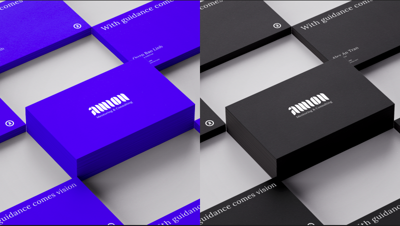
Branding and Logo
From the insights we have gained from working with high school students as a nonprofit organization for 5 years, we chose the color Dark blue as the main color for our branding since this color represents professionalism and friendliness - what AMION stands for.

Implementation

Front-end

04.a
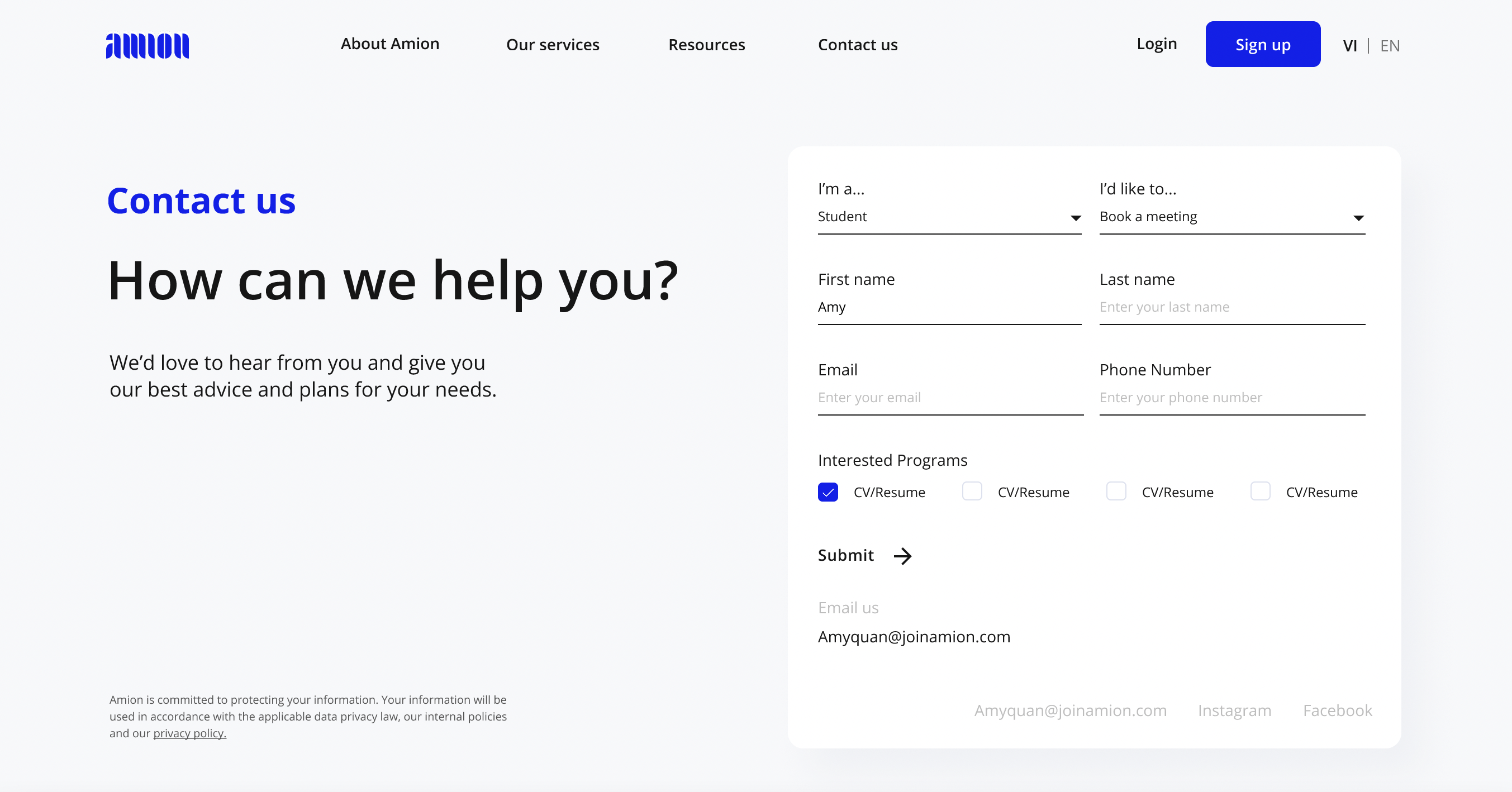
Once the logo and the graphic framework has been validated, I worked with another designer and the Figma for the interfaces were quickly created. To ensure the coherence and the efficiency of our interfaces, we worked with a design system that I settled for the project. The design system evolved along the project by having a lot of exchanges between me and the other designer to ensure the aesthetic but still stick with AMION's branding.

During the process I also worked closely alongside with the front-end developer to make sure the components we designed take into consideration technical's feasibility and made according changes.
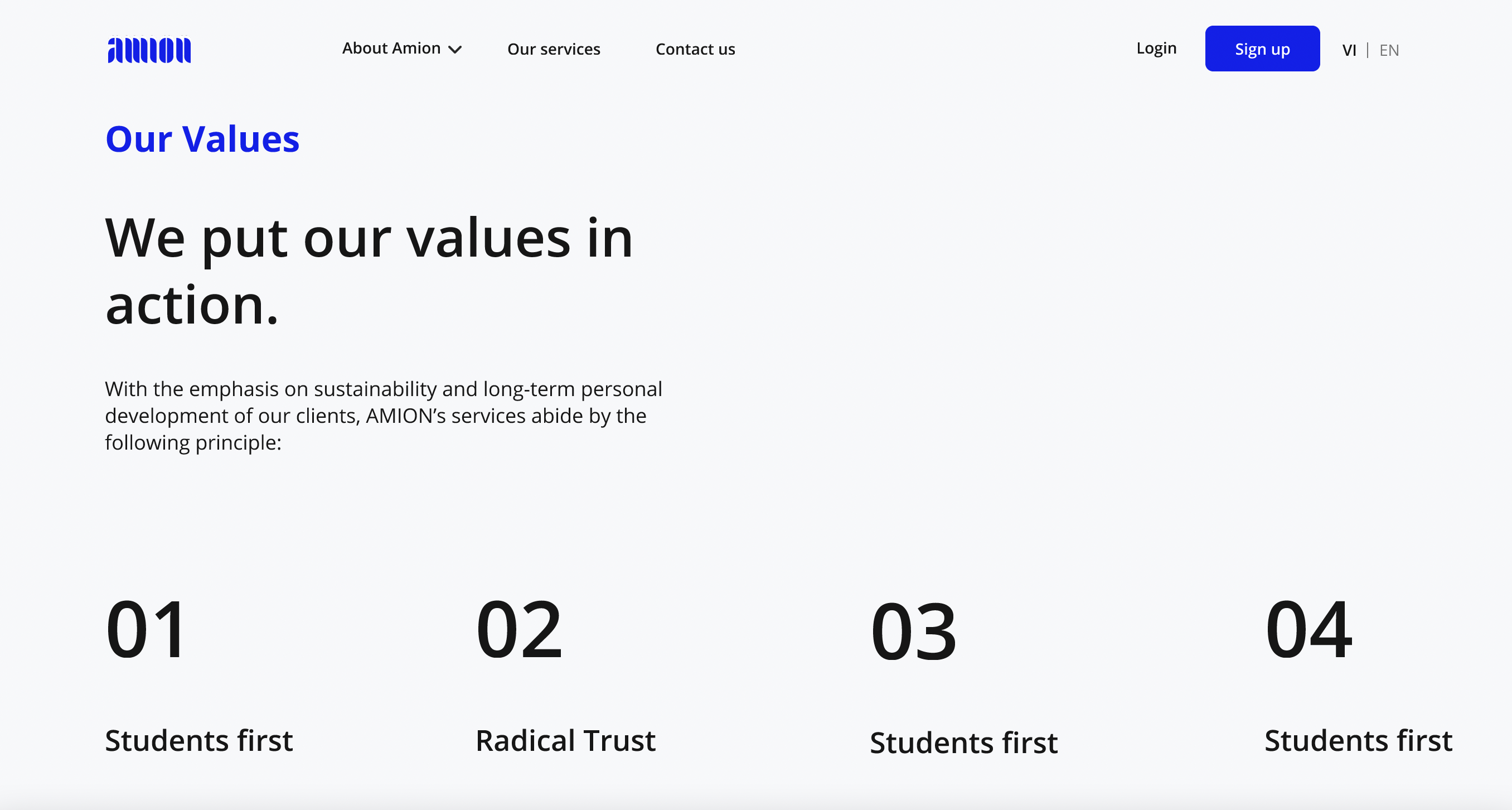
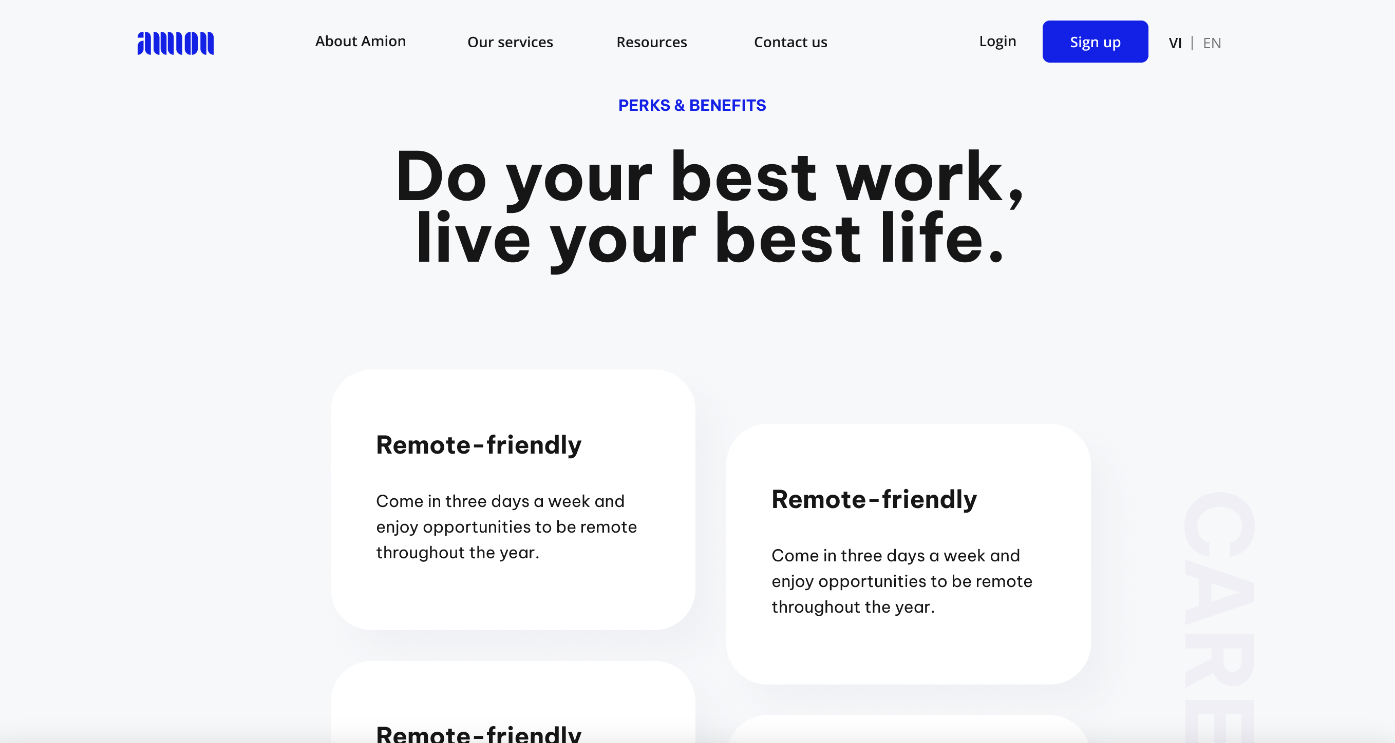
Selection of Interfaces
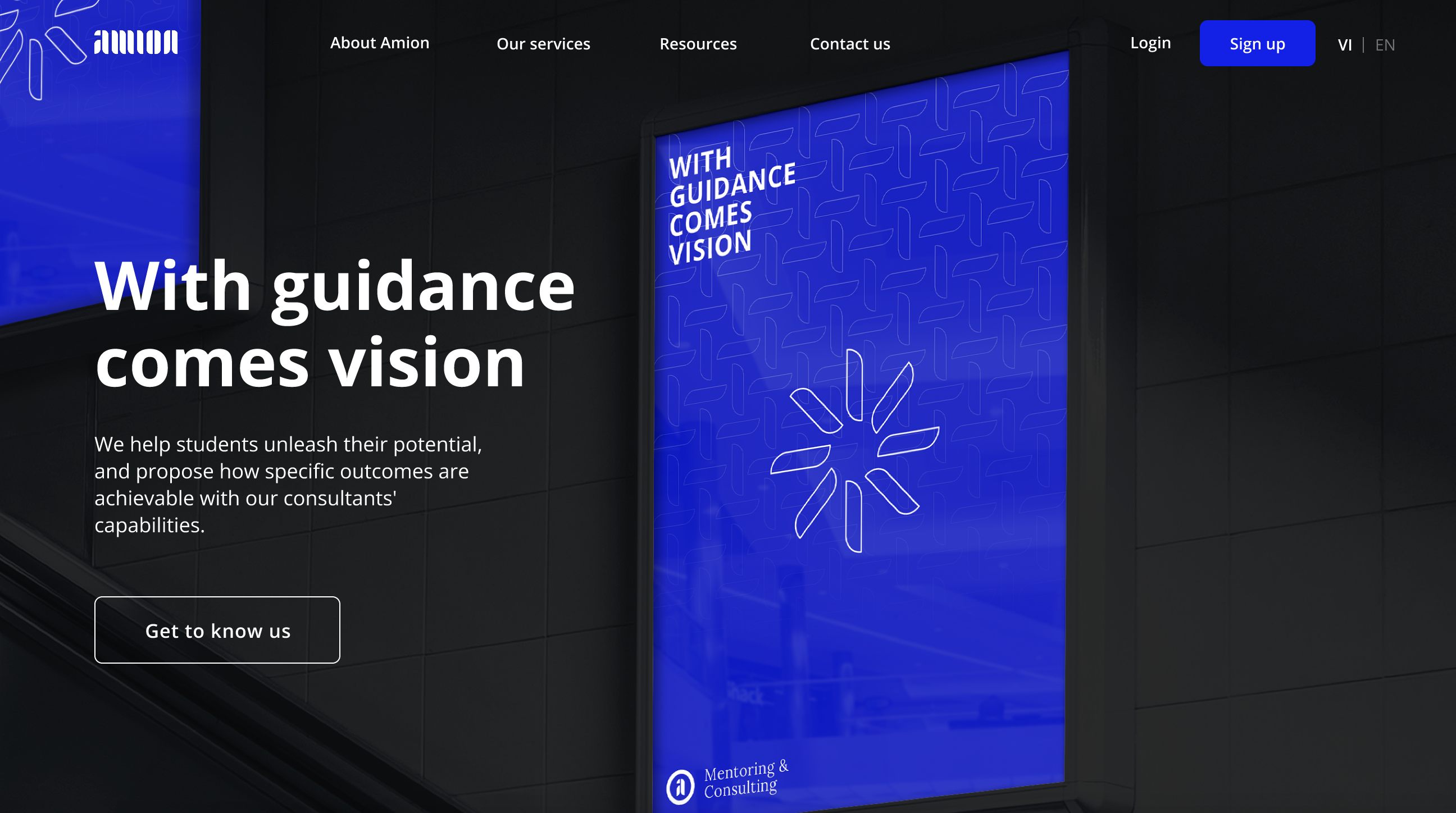
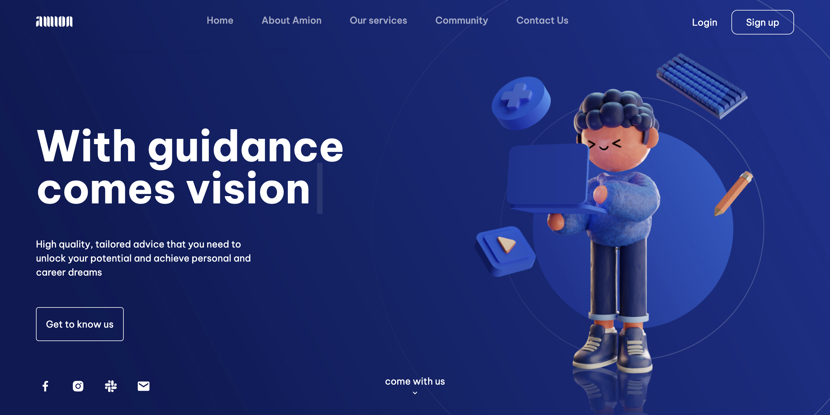
Home page

Review

Introspection

05
AMION was my very first freelance client. It made me realize how much works needs to be done in order to ensure the style is coherent for every complex component (cards, widgets, illustrations, etc ) and also maintain the technical feasibility for the developer's team. It allows me to work inside a team for a startup and to take into consideration the point of view of each stakeholder (Client, Development Team, Users), which affected my creative process a lot.
With this project, I made some huge development in UI Interface Design in terms of coherence, user interactions with the website and also with the Front-end coding side. I also had my first opportunity to create a design system which allows me to reflect and better organize for future projects.
THANKS TO AMION FOR HER TRUST

Next

WEBSITE GAME - UX/UI DESIGN

Lega-sea of

Truth

A collaborative in-class game that brings awareness about the psychological aspects of misinformation to high school students.
Get to know more